
A thoughtful rebrand last year took MAWBY and its wines in a whole new direction. MAWBY Wines rebranded the name of the actual winery departing from the previous L. Mawby Winery, which had two different labels — L. Mawby, which was bottle-fermented wine, and M. Lawrence which was tank-fermented wine — to just MAWBY. Following a customer survey using existing customers as well as customers that weren’t from the winery’s database, they found out there was some disconnect between the marketing and branding. People didn’t necessarily connect M. Lawrence to L. Mawby.
“We rebranded from L. Mawby to just MAWBY. That involved a label redesign, website, everything,” said Claire Lepine, MAWBY Direct-to-Consumer Manager. “We have a new look, and now we’re introducing a new product.”
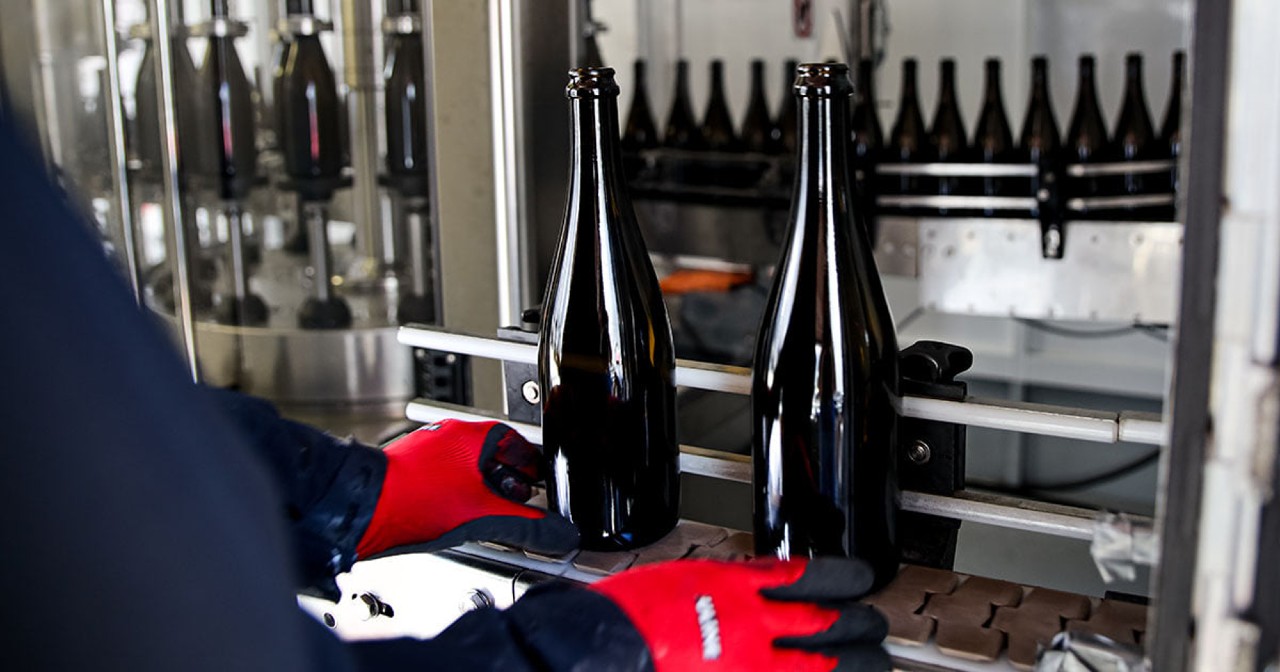
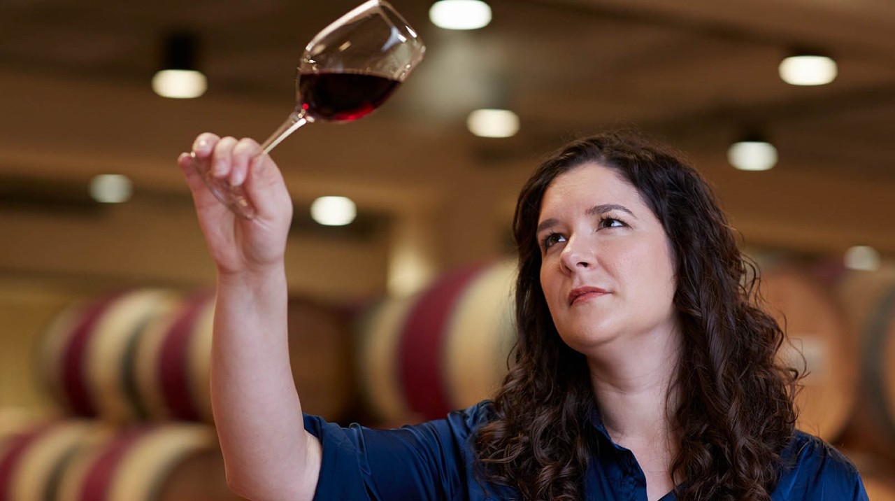
The Michigan winery made its first sparkling wine in 1983, and it’s been making exclusively sparkling wines since 2000. The winery just released cans for the first time in May.
“So we knew with the cans, whatever we put in cans, people would be a little more willing to try it out because of our history and because of our reputation, but because we had just rebranded, we picked out a few key designs from the rebrand and put those on the can and tried to make the name MAWBY big,” Lepine said.
The artist that designed the cans has been working with MAWBY for four iterations of labels.
The higher-end wine labels were made to look a little more sophisticated, while the less expensive wines have a more fun label.
The new branding shows a departure from a traditional label to a more modern look that reflects the brand.
“We have a word that we made up called ‘MAWBYness,’ and it’s a feeling, a sense of being … It’s this idea that our wines are for everyone, and we believe in being welcome and celebratory so we wanted something that really reflected that,” Lepine said.
“There are beautiful wine labels all over from these big houses in champagne that have been around for hundreds of years and there’s such an amazing history and story, and we know that being from an unexpected location — northern Michigan — by making such a range of wines with fun names, we could be a little more colorful and be a little more open. And that’s really who we are. If you come visit us, that’s what we try to capture.”
Similarly to MAWBY, Niven Family Wine Estates’ brands are modern but they have classic touches. When developing the labels for the Baileyana, Tangent, True Myth, and Zocker brands, the goal was to have prominent and compelling artwork. Once the story of the winery’s story and brand essence was perfected, the labels followed.
“Building a brand today is a whole lot different than building a brand 20 years ago,” said John H. Niven, Brand Ambassador for Baileyana Winery. “Consumers have so many choices and are bombarded with endless buying propositions. Marketing today has become so visual with a huge shift towards consumers digesting their experiences visually. Our vision with all of these labels was to leave a lasting visual impact on the consumer.
“More importantly, we wanted labels that spoke to the essence of each brand and created an emotional connection.”
The last label refresh the Edna Valley, California winery had was with Tangent, which had a modern font. Instead of tweaking the label, they did a full redesign to better align the label visuals with the brand’s messaging — a departure from the ordinary.
“Tangent is pure, modern, and vibrant,” Niven said. “Tangent solely focuses on fresh and crisp unoaked white wines. It was important for the label to portray the style of the wine along with the fresh vibe of the brand.
“We used mid-century art as the inspiration but also added in elements of watercolor and design bursts to align with the vibrancy of Tangent.”
Baileyana, on the other hand, is about modern elegance and sophistication.
“The label features an abstract rendering of the flower from the Baileyana Acacia tree,” Niven explained. “The intricacies of the gold foil and its embossing delivers beautiful label art that aligns with the refined elegance of our Chardonnay and Pinot Noir wines.”
True Myth is intriguing and is about embracing the life less ordinary, with labels that are different from traditional Cabernet and Sauvignon Blanc labels.
“The artwork is alluring and the consumer is rewarded the more they dig into their detail,” Niven said. “I can’t tell you how many times someone has said they never noticed Mother Nature in the background, yet how excited they were when they finally discovered that element. That’s a great example of the memorable emotional connection for which we are striving.”
Be the first to comment